
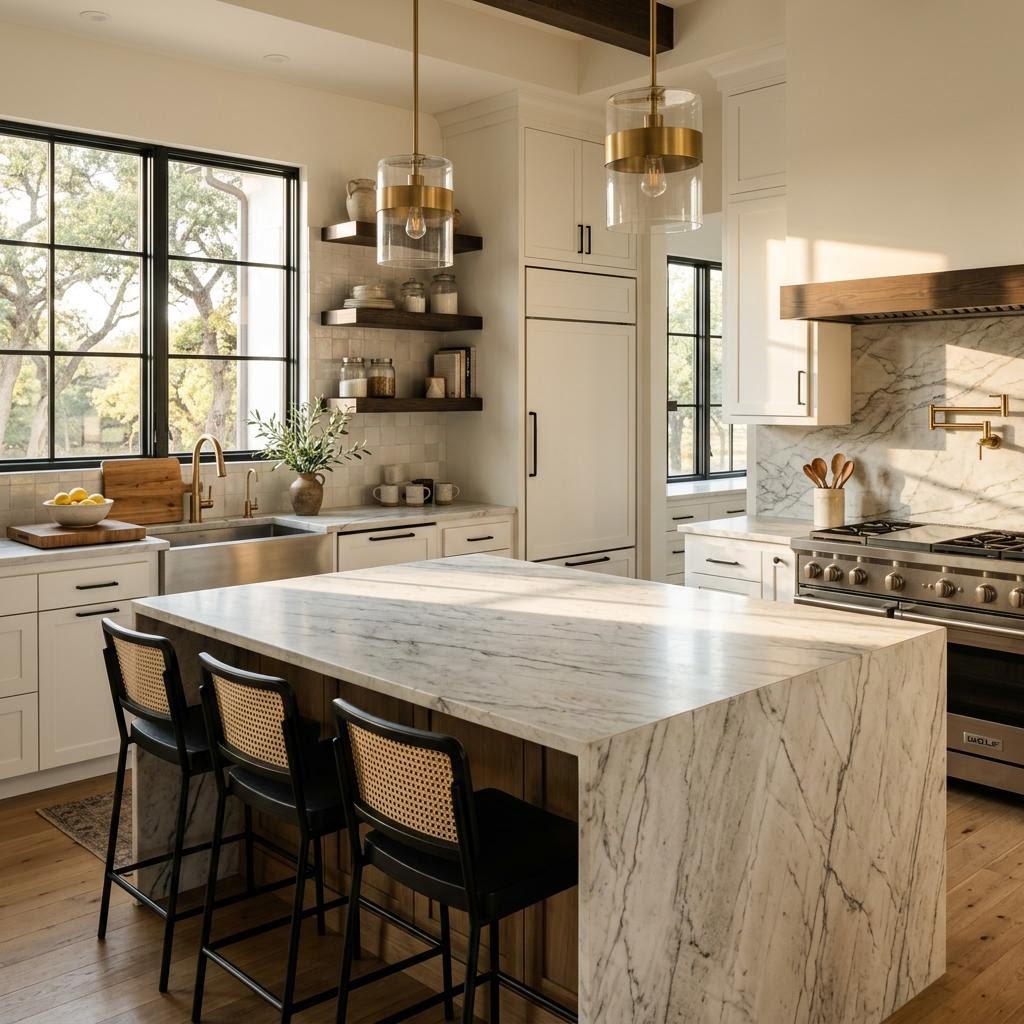
If the countertop has strong movement, does the floor need to be quieter? Compare the two surfaces together, paying attention to undertones, pattern scale, and contrast rather than trying to match color names.
Successful spaces are built from materials that support each other through color, scale, texture, and everyday function.
Permian Basin homeowners use The Design Gallery to compare full-size materials in one place, allowing them to coordinate surfaces that fit both their home and their lifestyle.
Start with the surface that has the strongest visual voice
A common mistake is selecting both materials simultaneously without deciding which one should lead the design. In most kitchens, either the floor or the countertop will naturally become the dominant visual element. Once you identify the lead feature, the second choice becomes much easier.
If your floor covers a large open-concept area, your hardwood and LVP flooring may serve as the primary design anchor, meaning the countertop should complement it rather than compete. Conversely, if your kitchen features a dramatic island or a statement slab from our countertop selection, that element may lead, with the flooring chosen to provide balance underneath.
A simple way to think about it:
- Busy floor + busy countertop usually feels chaotic.
- Quiet floor + dramatic countertop often feels refined.
- Warm floor + cool countertop can work, but only when the undertones intentionally connect.
- Similar tones with different textures usually create the most natural cohesion.
For example, if you already have medium-warm oak-look flooring, a soft cream, taupe, or warm white countertop often feels more settled than a stark icy white slab with blue-gray veining. In many West Texas homes, especially those with warm natural light and dust-prone outdoor conditions, materials that lean slightly warm tend to feel more grounded and livable.
Effective design should begin by identifying the visual anchor first. When multiple surfaces compete for attention, the room rarely feels cohesive.
Match undertones before you match colors
Coordination requires more than finding the same color family; it depends on undertones. A beige floor might have pink, yellow, gray, or green undertones, while a white countertop can lean creamy, cool, or taupe. If these undertones conflict, the kitchen will feel unbalanced, even if the colors seem similar at first glance.
This is especially significant in the Permian Basin, where strong sunlight reveals undertones quickly. A material that looks neutral in a sample may appear significantly different once installed across a full kitchen.
Here’s a practical way to evaluate undertones:
- Look at your flooring sample and ask: does it read warm, cool, or neutral?
- Place your countertop sample next to it in daylight, not just under showroom bulbs.
- Then compare both against your cabinet color.
- If one element suddenly looks muddy or too sharp, the undertones are probably misaligned.
Some combinations that tend to work well:
- Warm wood-look flooring with creamy quartz, soft white granite, or taupe-veined surfaces
- Neutral greige flooring with balanced white or light gray countertops
- Deep brown flooring with counters that provide contrast without going sterile
- Light natural flooring with subtly veined countertops for softness and movement
Some combinations that need extra care: