Flooring6 min readJuly 14, 2026Updated November 19, 2026
How to Coordinate Carpet With Hardwood Flooring
Learn how to choose carpet colors that blend beautifully with existing hardwood floors for a cohesive home design.
Thinking About Updating Your Home?
Whether you're exploring flooring, countertops, kitchens, or bathrooms — our free Design & Planning Session helps you understand your options and create a clear path forward.
Start with the wood's undertone before choosing carpet for an adjoining room. A sample that looks neutral on its own may turn pink, yellow, or gray beside the hardwood, especially as the light changes.
Creating an effective carpet-and-wood combination isn't about matching materials perfectly; it is about establishing a color palette that feels calm, intentional, and balanced.
Start with the undertone of the hardwood, not the carpet
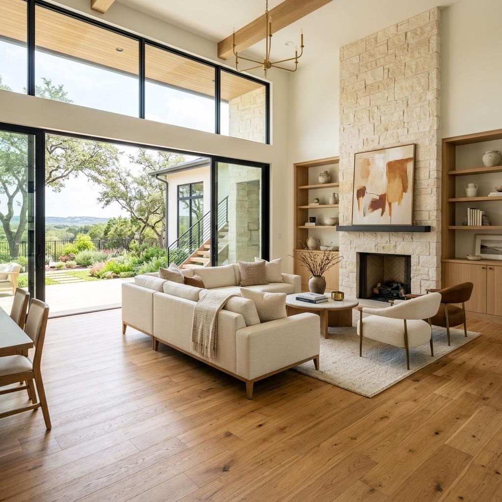
The visual temperature of your home is often set by the hardwood. If your wood floors feature warm golden, honey, red, or caramel undertones, carpet in a warm color family usually creates the most natural transition. If your wood has taupe, greige, ash, or muted brown undertones, cooler neutral carpets generally provide a more seamless look.
Many feel they need an exact color match, but this often results in a flat appearance. Coordination through consistent undertones works much better, treating the flooring as a family of colors rather than identical tones.
For example, medium brown hardwood floors often pair beautifully with:
Soft taupe carpet for a balanced, upscale look
Warm beige carpet for a cozy, classic feel
Greige carpet when the wood has muted or neutral undertones
Mushroom-toned carpet for a richer transition that hides soil well
If you're comparing options for hardwood flooring or trying to work around existing wood floors, bring home large carpet samples and place them against the hardwood in morning light, afternoon light, and lamplight. West Texas sun can shift color more dramatically than homeowners expect, especially in homes with large windows.
Use contrast carefully so the transition looks intentional
A beautiful home doesn't require the carpet to be nearly identical to the wood tone. In fact, a little contrast often helps define spaces in a sophisticated way. The key is staying within a believable range. If your hardwood is dark espresso or deep walnut, a carpet in soft oatmeal, warm greige, or muted sand can create a polished break that feels designed on purpose. If the contrast becomes too extreme, though, every doorway starts to call attention to itself.
In many Midland and Odessa homes, common areas are more open than they were years ago. That means you don't just see one room at a time; you see flooring transitions from across the house. A dark wood in the hallway leading into a bright cool-gray carpeted bedroom may sound fresh on paper, but in practice it can feel abrupt unless the wall color, trim, and furnishings help bridge the gap.
Our design team typically recommends one of these transition strategies:
Low contrast: Carpet sits within a few shades of the hardwood, creating a quiet, seamless feel.
Medium contrast: Carpet is lighter than the wood but shares the same undertone, making the change noticeable but elegant.
Texture-led blending: A patterned or heathered carpet mixes multiple neutrals, helping tie together wood, wall paint, and furniture.
When selecting a floor color, avoid bright trend-driven shades. The best results typically come from layered neutrals that offer enough depth to manage foot traffic while providing enough softness to complement the wood.
Want To See These Styles In Your Own Home?
Visualize flooring, countertops, and tile in your actual space before you decide. No design experience required.
POWERED BY ROOMVO — COMING SOON
If you're exploring broader flooring options for your home, it's helpful to think of the bedroom carpet as part of your whole-home palette, not an isolated finish.
The safest carpet colors are rarely plain beige
Beige has long been the default answer, but today's best carpet selections are more nuanced than that. In the Permian Basin, where dust, sunlight, and active households all influence performance, the most successful carpet colors often include subtle variation. A flecked taupe, warm greige, soft stone, or mushroom blend can look cleaner longer than a flat solid color while also pairing more naturally with hardwood.
Here are the shades The Design Gallery recommends most when blending carpeted bedrooms with hardwood common areas:
Warm greige: One of the most versatile choices for homes with medium brown or neutral hardwoods
Mushroom: A refined mix of gray, beige, and brown that works especially well in transitional interiors
Soft taupe: Ideal for homeowners who want warmth without going too yellow
Natural oatmeal: Lighter, airy, and inviting when paired with deeper hardwood tones
Heathered beige-brown blends: Excellent for durability and visual connection with wood grain
These choices are especially effective when homeowners want bedrooms to feel softer and quieter than the living spaces without making them look disconnected. If your family prefers the comfort of carpet in bedrooms and stairs but loves the richness of hardwood in common areas, these in-between neutrals usually provide the cleanest result.
It is important to avoid selecting carpet based solely on online photos. The same material can appear quite different depending on the adjacent hardwood, lighting, and time of day. Comparing physical samples side-by-side in your own home environment remains the most reliable way to ensure a good match.
Think beyond flooring: wall color, trim, and lighting matter too
Sometimes the carpet and hardwood are not the real problem at all. The transition feels off because the paint color pulls in a competing undertone, or because bright white trim makes the flooring change look harsher than it really is. In many Odessa and Midland remodels, we help homeowners step back and view flooring as one piece of a larger visual system.
If your hardwood is warm and your carpet is neutral but the walls are a cool blue-gray, the whole combination can feel unsettled. If your carpet is light and your wood is medium brown, adding warmth through wall color, area rugs, or textiles can make the transition feel more natural. The most polished homes in West Texas rarely rely on one perfect flooring choice; they create harmony across surfaces.
This is also why larger samples matter so much. At The Design Gallery, we want homeowners to see not only how carpet looks next to the hardwood, but how both interact with cabinetry, paint, lighting, and furniture. That broader view often turns a stressful decision into a confident one.
If you're planning a bigger update, comparing new hardwood selections alongside soft-surface options can reveal combinations you may not have considered but that fit your home's architecture and your family's lifestyle far better.
Ready to Love Your Home Again?
If you are planning to update your floors and want to ensure a professional, intentional transition between rooms, schedule a design consultation or visit our showroom to view samples in person. You can also reach out to our team for expert guidance on selecting materials that fit your home's unique style and lifestyle.
Considering New Flooring?
The right floor sets the tone for your entire home. Our team helps you compare materials, styles, and finishes to find what works best for your space and lifestyle in Odessa or Midland.
Why West Texas Homeowners Trust The Design Gallery
For more than 35 years, homeowners throughout Odessa, Midland, Andrews, Big Spring, Greenwood, Gardendale, Monahans, Seminole, Stanton, and surrounding communities have trusted The Design Gallery by Paul Evans for flooring, countertops, kitchen remodeling, bathroom remodeling, and cabinetry.