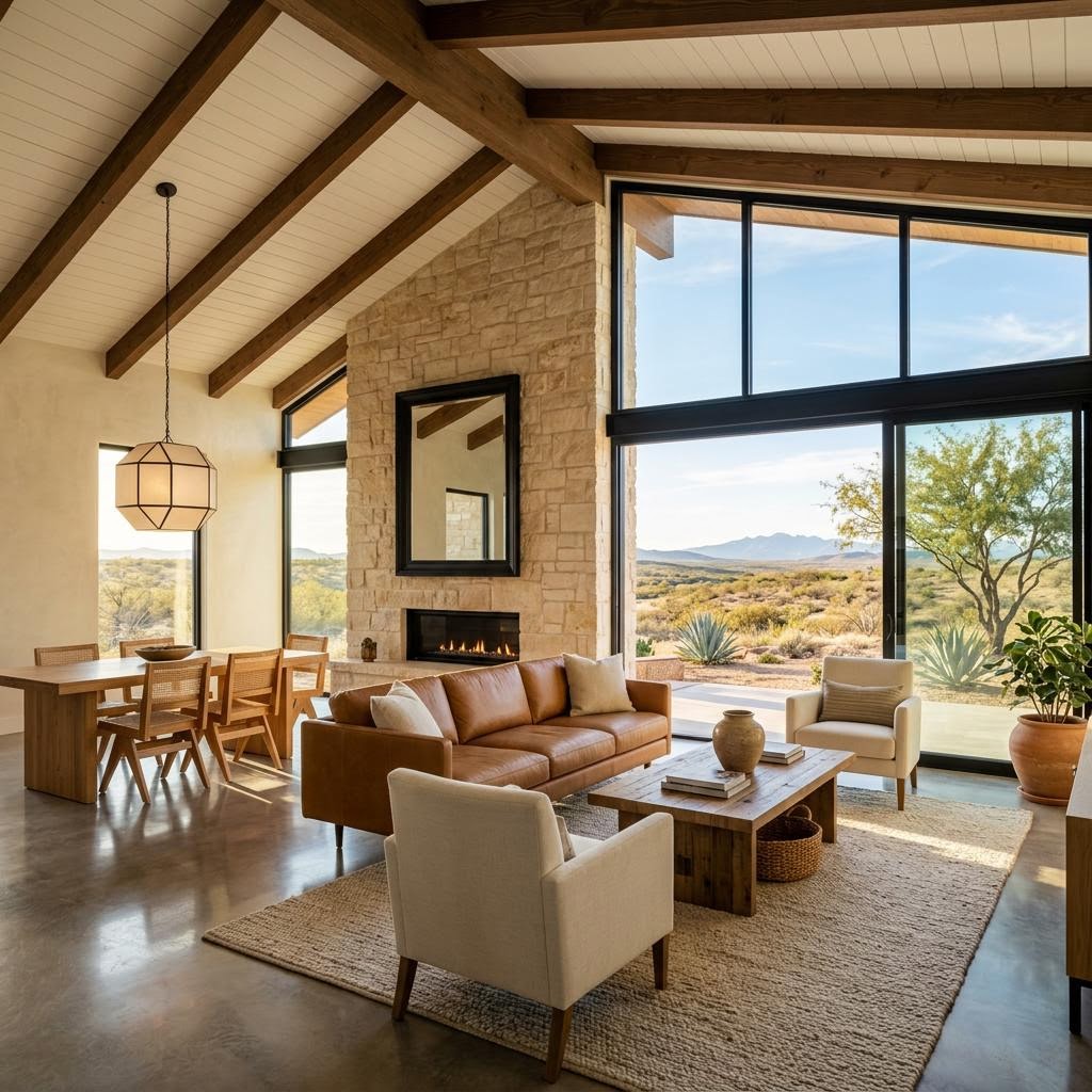
Paint Colors That Clash With Your Finishes?
If you're like most Odessa homeowners trying to update a room without making an expensive mistake, you've probably wondered why a paint color that looked perfect on a sample chip suddenly feels wrong once it's on your walls. When paint fights your flooring, countertops, or cabinets, the whole room can feel off even if every individual finish is high quality. And in West Texas, strong sunlight can exaggerate undertones fast, turning a color that seemed safe into something too yellow, too pink, too gray, or just plain disconnected from the rest of your home.
Here's what decades of helping West Texas homeowners has taught us: choosing paint should start with your fixed finishes, not with a trendy swatch you happened to like online.
Since 1988, Permian Basin homeowners have trusted The Design Gallery because our design team helps them coordinate paint with real materials like flooring, countertops, cabinets, and lighting before costly decisions are made.
Start With What You Can't Easily Change
The biggest mistake we see in Odessa and Midland is homeowners choosing paint first and then trying to force everything else to match. Paint is one of the easiest elements to change later. Your floors, stone surfaces, tile, and cabinetry are usually the larger investment, so those finishes should lead the conversation.
If you're researching how to choose paint colors home Odessa TX, begin by identifying the fixed or semi-fixed elements in the room:
- Flooring: wood, tile, LVP, carpet, or stone tones
- Countertops: quartz, granite, marble-look, or solid surface patterning
- Cabinets: painted, stained, warm wood, cool wood, or mixed finishes
- Backsplashes and tile: especially if they have noticeable gray, beige, green, or cream undertones
- Large furnishings: if they are staying and visually dominant
For example, if your home has warm oak cabinets and beige-toned hardwood and LVP flooring, a crisp blue-gray paint that looks beautiful on Instagram may make those warmer surfaces appear dated or muddy. On the other hand, if you have cooler quartz counters and bright white trim, an overly creamy wall color can make the entire room feel yellow.
At The Design Gallery, we often tell Permian Basin homeowners to lay out samples together before choosing any wall color. Put your flooring sample beside your countertop, cabinet door, backsplash, and trim color. Then ask a simple question: What undertone is showing up again and again? That repeated undertone usually points you toward a paint family that will feel coordinated rather than random.
If you're planning updates beyond paint, this is also why many families start by selecting kitchen cabinets and countertops first, then narrowing the paint palette afterward. It creates a much more confident process.
Understand Undertones Before You Pick a Shade
Undertones are where most paint mistakes happen. A color may look like a plain white, greige, taupe, or gray at first glance, but underneath it could lean pink, green, yellow, violet, or blue. In Midland and Odessa homes, those hidden undertones become much more obvious once natural light hits the walls.
Here's a practical way to think about undertones:
- Warm finishes often carry yellow, gold, red, or creamy beige undertones.
- Cool finishes often carry gray, blue, green, or crisp white undertones.
- Neutral finishes still have undertones, but they tend to be softer and easier to coordinate.
Now compare those undertones across the room. If your flooring has a warm honey base and your countertops have a cooler gray vein, you don't necessarily need to match one exactly. But you do need a wall color that can bridge both without making either one look wrong.
That usually means avoiding extremes. Instead of the iciest gray or the creamiest beige, look for a balanced neutral with enough softness to connect the room. This is one of the most important steps in how to choose paint colors home Odessa TX, because a balanced paint color can calm visual tension between mixed materials.
A few neighborly guidelines from our design team:
- Don't judge paint by the chip alone. Small swatches hide undertones.
- Compare whites side by side. One white can look clean, while another right next to it suddenly looks pink or yellow.
- Watch gray carefully. Gray paint is rarely just gray, especially under West Texas sun.
- Let your countertop and flooring talk first. If they already set the room's temperature, your paint should support that direction.
If you're remodeling an older Odessa home with a mix of existing surfaces, bringing those samples into the showroom can save a lot of second-guessing. It's much easier to catch an undertone conflict before gallons are ordered.
Test Paint in West Texas Light, Not Just Store Light
Lighting changes everything. A paint that seems soft and neutral in the store can look dramatically brighter, flatter, warmer, or cooler once it goes up in your home. In the Permian Basin, abundant sunlight can wash out some colors and intensify others, especially in rooms with large south- or west-facing windows.
That's why testing is essential if you want to learn how to choose paint colors home Odessa TX the right way. Don't rely on one tiny brushstroke in a dark corner. Instead:
- Buy sample sizes of your top 2 to 4 colors.
- Paint large boards or sample areas on multiple walls.
- View them in morning, afternoon, and evening light.
- Look at them with lights on and off.
- Compare them next to flooring, countertops, and cabinets.
This step matters even more in open-concept homes around Midland and Odessa, where one wall color has to work across kitchen, living, and dining spaces. A color that seems perfect near the fireplace may turn too green next to the cabinets or too stark over your tile.
We also recommend evaluating sheen as part of the process. Flat and matte paints absorb light differently than eggshell or satin, which can slightly change how the color reads. If your walls have texture, common in many West Texas homes, that texture can create shadows that deepen the appearance of certain shades.
If you're already updating finishes, coordinating paint with new flooring selections or a kitchen remodel during the planning stage is far easier than trying to adjust after installation.
Create Flow From Room to Room
Another common frustration is choosing one good color at a time without thinking about the whole house. The result is a home that feels chopped up, even if each room looks fine on its own. The better approach is to create a simple color story with consistency from space to space.
That doesn't mean every room in your Odessa home needs to be identical. It means the colors should relate. Usually, that looks like:
- One main neutral for shared living areas
- A coordinating trim and ceiling white
- One or two secondary neutrals for bedrooms or baths
- Accent colors used intentionally, not randomly
When homeowners ask our team about how to choose paint colors home Odessa TX, we often help them narrow to a small palette that works with the home's permanent materials first. From there, each room can have its own personality without losing flow.
This is especially helpful if you're preparing for a larger remodel in West Texas. Paint choices become much easier when they support the broader design instead of competing with it.
Ready to Love Your Home Again?
If you're tired of guessing which paint colors will actually work with your flooring, countertops, and cabinets, The Design Gallery is here to help. Our team works with homeowners across Odessa, Midland, and the Permian Basin to create coordinated spaces that feel comfortable, timeless, and right for the way you live. Schedule a FREE in-home design session or visit the showroom at The Design Gallery — (432) 367-0995 · 4101 E University Blvd, Odessa TX · tdgtexas.com. Schedule Your Free Design Session →