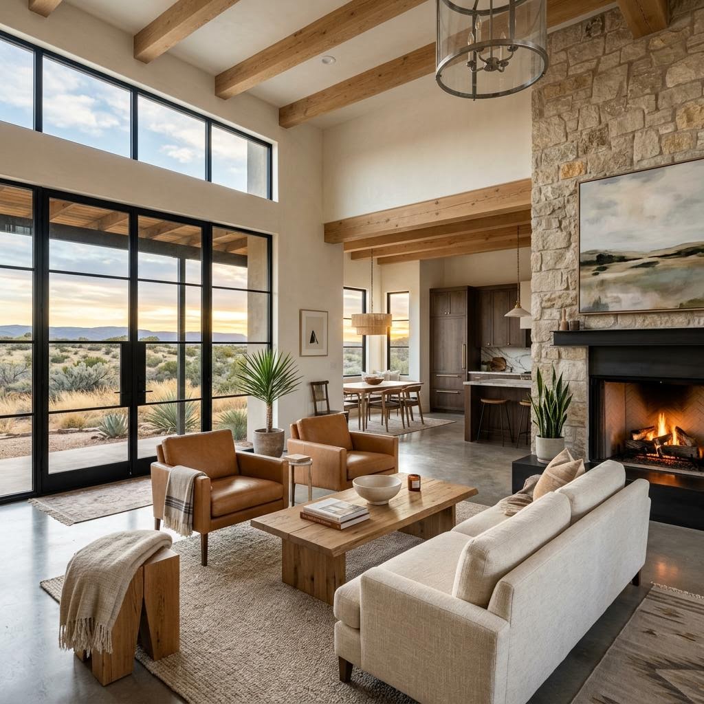
Why Your Paint Looks Wrong After New Floors
If you're like most Odessa homeowners trying to update one room at a time, have you noticed that the paint color you loved in the store suddenly looks off once new flooring goes in? That mismatch can make an otherwise expensive remodel feel unfinished, even when each choice looked beautiful on its own. Left uncorrected, it often leads to repainting, replacing samples, and living with a home that never quite feels pulled together.
Here's what decades of helping West Texas homeowners has taught us: successful design starts with understanding undertones first, then building paint and flooring choices around them.
Since 1988, Permian Basin homeowners have trusted The Design Gallery because we help them compare materials, lighting, and finishes together in one place so costly color mistakes are far less likely.
Undertones Matter More Than Shade
Most people think they are matching light to light or dark to dark. In reality, the bigger issue in paint and flooring coordination Odessa TX home design is whether the undertones agree. Two floors can both look "brown" and still fight with the same wall color if one leans golden-orange and the other leans taupe, gray, or red. The same is true for white paint. One white may have creamy yellow warmth, while another has a crisp blue-gray cast. Put the wrong white next to the wrong floor, and the whole room can suddenly look dingy, pink, yellow, or cold.
That is why our showroom designers in Odessa and Midland encourage homeowners to stop asking, "Is this color lighter or darker?" and start asking, "What is underneath this color?" Warm woods usually carry yellow, honey, amber, or red undertones. Cool-toned surfaces often show gray, ash, taupe, or even subtle green-blue influence. Bold tile may introduce clay, charcoal, black, rust, beige, or patterned contrasts that change the way wall color reads throughout the day.
A practical way to test undertones is to place your paint sample directly against the flooring sample, then view both in morning light, afternoon light, and lamp light. In West Texas, intense natural light can make warm colors look even warmer and cool grays look flatter than expected. What seemed balanced in a paint fan deck may feel completely different in your actual home. This is one reason homeowners shopping for new flooring options benefit from evaluating paint, flooring, and trim together instead of making isolated decisions.
As a rule, if your floor has a strong undertone, your wall color should either complement it quietly or provide intentional contrast. What rarely works is accidental contrast—when a paint color misses the undertone by just enough to feel like a mistake instead of a design choice.
How to Match Warm Wood Tones Without Making the Room Too Yellow
Warm wood floors remain a favorite across the Permian Basin because they add familiarity, comfort, and timeless character. But they can be tricky to pair with paint if you do not account for the exact warmth in the wood. Honey oak, walnut, hickory, and other warm species often look best with wall colors that soften the warmth rather than compete with it.
If the wood leans golden or amber, overly creamy beige paint can push the whole room into a yellow cast. Instead, many Odessa homeowners do better with muted warm whites, greiges, soft taupes, or balanced off-whites that have enough neutrality to calm the wood. If the floor has red-orange warmth, a slightly earthier wall color often feels more grounded than a pale yellow-beige. The goal is not to match the floor exactly. The goal is to create a relationship where the floor feels intentional and the walls support it.
When clients are selecting hardwood flooring, we often recommend these guidelines:
- Golden wood tones: pair with soft greige, warm white, or light taupe instead of buttery beige.
- Red-toned wood: pair with neutralized warm whites or mushroom tones that reduce visual redness.
- Dark warm wood: use lighter wall colors with a clean but not icy undertone so the room feels open, not heavy.
Trim color matters too. Bright stark white trim beside warm wood can sometimes make the floor look more orange than it really is. A softer white may create a smoother transition. This is where paint and flooring coordination Odessa TX home design becomes less about trends and more about balance. In many Odessa and Midland homes, especially those with open layouts, one wrong undertone can echo from room to room and make the entire main living space feel disconnected.
How to Handle Cool Gray LVP Without Making Your Home Feel Cold
Cool gray and gray-brown luxury vinyl plank became popular because it feels clean, versatile, and modern. But many homeowners in West Texas discover that not every gray floor is truly neutral. Some lean blue. Some lean taupe. Some read almost green in certain lighting. If you choose paint that is cooler than the floor, the room can start to feel sterile. If you choose paint that is too warm, the contrast can look muddy instead of cozy.
That is why choosing luxury vinyl plank flooring should always involve wall color discussion from the beginning. A cool gray LVP often works best with soft whites, balanced greiges, or very subtle warm neutrals that keep the space inviting. In Odessa homes with strong sun exposure, we frequently caution against paint colors that are too icy or too blue, because the natural light can exaggerate that chill.
Here are a few design rules our showroom team uses often:
- If the LVP has a blue-gray cast, avoid blue-white paint unless you want a deliberately crisp, contemporary look.
- If the LVP is more taupe-gray, lean into flexible greiges that bridge warm and cool elements well.
- If cabinetry, countertops, or furniture are warm, use wall color to connect them to the floor rather than forcing everything cooler.
Many Midland and Odessa homeowners assume gray floors require gray walls. They do not. In fact, matching them too closely can flatten the room. A better approach is to let one element lead and let the other support. The floor usually becomes the anchor; the wall color should help the eye move naturally through the space.
What to Do With Bold Tile, Patterned Floors, and Statement Surfaces
Bold tile can be stunning, especially in bathrooms, kitchens, fireplace areas, and entryways. But the more visual personality your floor has, the more disciplined your wall color needs to be. Patterned tile, dramatic veining, terracotta looks, black-and-white designs, and richly colored porcelain all introduce multiple undertones at once. That means the wrong paint does not just clash with one color—it can pull out the least flattering note in the whole installation.
With statement tile, start by identifying the quietest repeat color in the pattern, not the loudest one. That quiet color often makes the best wall reference point. If your tile includes warm clay and cream, a muted warm neutral on the walls usually works better than trying to match the rust accent exactly. If your tile is charcoal and white, a soft white or pale greige may feel more timeless than a trendy dark wall that competes for attention.
In our showroom, we often remind homeowners across the Permian Basin that flooring is a large visual surface. The larger the surface, the more influence it has on the room's mood. For that reason, paint and flooring coordination Odessa TX home design should never be decided from tiny samples alone. Sample boards, room lighting, cabinet finishes, and adjacent materials all have to be considered together.
If you are updating more than one surface, it also helps to begin with the hardest-to-change element first. Flooring and tile usually come before paint because repainting is simpler than replacing a full floor. Homeowners exploring hardwood and LVP flooring options often save time and money by selecting the floor first, then narrowing wall colors that truly complement it.
The Combinations TDG Designers Recommend Most
Over the years, some combinations consistently perform well in Odessa, Midland, and across West Texas homes because they feel current without being fragile to changing trends.
- Warm medium wood + soft greige walls: dependable, welcoming, and especially strong in open-concept homes.
- Honey oak or warm oak + neutralized off-white: brightens the room without amplifying yellow.
- Taupe-gray LVP + balanced white: clean and versatile, with enough warmth to feel lived in.
- Cool gray LVP + light greige: softens the chill and connects mixed finishes more naturally.
- Bold patterned tile + quiet supporting wall color: keeps the feature feeling custom rather than busy.
The common thread is restraint. Good coordination does not require everything to match. It requires each finish to make the others look better. That is the heart of paint and flooring coordination Odessa TX home design, and it is why seeing full-size samples in person matters so much. What works in a phone photo may not work under West Texas sunlight, your furniture, or the fixed finishes already in your home.
Ready to Love Your Home Again?
If you're tired of guessing whether your paint and flooring will work together, The Design Gallery is here to help. Schedule a FREE in-home design session or visit the showroom to compare materials, undertones, and finishes with an experienced team that understands Odessa, Midland, and West Texas homes. Call (432) 367-0995, visit us at 4101 E University Blvd, Odessa TX, or learn more at tdgtexas.com. Schedule Your Free Design Session →