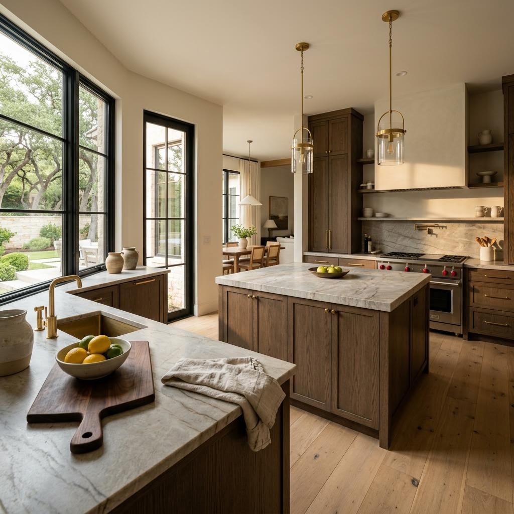
Would a warmer countertop make the kitchen more inviting, or would a quieter pattern better suit the cabinets? Compare undertones and veining with the whole room before treating white or gray as the only neutral choices.
The right countertop color does more than follow a trend; it influences the mood, depth, and character of the kitchen.
Why White and Gray Aren't the Only "Timeless" Choices Anymore
For years, white and cool gray countertops were the standard. While they offered a clean, predictable aesthetic, many homes now feel too cold, especially when paired with updated flooring and paint. Designers are shifting toward tones that provide warmth and contrast without appearing trendy or short-lived.
The current conversation around surface selection is moving away from icy undertones toward materials that create a welcoming, grounded atmosphere.
What does that mean in practical terms?
- Warm whites are replacing stark whites.
- Greige and taupe undertones are softening formerly all-gray kitchens.
- Earth-based neutrals like sand, camel, clay, mushroom, and coffee tones are adding comfort.
- Natural-looking movement is taking priority over flat, uniform slabs.
Timeless is no longer synonymous with light and plain. It now refers to a design that is balanced and layered. When updating countertops, prioritize asking: What color will remain beautiful and grounded with the way we actually live?
That's especially important in the Permian Basin, where sunlight, dust, open layouts, and family traffic all affect how a surface looks day to day. A countertop that seems perfect in a photo can feel very different under real Odessa or Midland light.
Warm Earth Tones and Layered Neutrals
Warm, nature-inspired colors offer an alternative to bright white and cool gray countertops. Think creamy beige, soft brown, weathered stone, muted terracotta, bronzed taupe, and layered neutrals with depth. These shades pair beautifully with the cabinet colors and flooring choices many West Texas families are already leaning toward—warmer woods, painted cabinets in softer neutrals, and mixed-metal finishes.
Why are these colors working so well right now? Because they solve a problem many homeowners feel but struggle to name: a kitchen can be updated and still somehow feel emotionally cold. Warm earth tones fix that by making a room feel settled, lived-in, and connected.
Some of the most requested directions we are seeing include:
- Mushroom and taupe quartz for a soft, elevated neutral base
- Beige-based stone looks that work with cream cabinets or white oak
- Moody brown-black blends for islands that need contrast
- Sand and travertine-inspired patterns that feel organic rather than stark
These surfaces can work especially well when paired with a full kitchen remodel rather than treated as a standalone decision. Countertops should support the whole design story—your backsplash, flooring, cabinet profile, and even the tone of your hardware.
For those updating their space, warm designs are proving to be more enduring than the cool grays that dominated previous years.
Dramatic Veining Is Getting Bolder—But Also Smarter
Another major trend for Odessa and Midland homes is dramatic veining. Homeowners still love the elegance of marble-inspired movement, but the look is evolving. Instead of thin, repetitive gray lines on a bright white background, bolder veining offers richer contrast and warmer tones.
That can include charcoal, taupe, bronze, caramel, or even subtle gold veining depending on the slab. The result is a surface with more character and a more custom feel.
But here's the key: dramatic doesn't have to mean overwhelming.
The best applications usually follow one of these approaches:
- Statement island, calmer perimeter: let one area carry the movement while the rest stays quieter.
- Bold slab, simple cabinets: create balance so the room feels intentional, not busy.
- Veining that repeats room tones: choose a slab that pulls from your flooring, wall color, or wood accents.
A slab may look stunning individually, but if the undertones clash with the rest of the room, the result feels disjointed. It is helpful to review samples alongside hardwood and LVP flooring, cabinet finishes, and backsplash options before deciding.
In West Texas homes with abundant natural light, dramatic veining can look especially beautiful because the movement reads clearly without feeling heavy. For open-concept homes in Midland and Odessa, it can also help define the kitchen as a focal point without relying on overly trendy color everywhere else.
Emerging surface trends offer a significant visual impact for those seeking an elevated and memorable kitchen aesthetic.
The Bold Looks West Texas Homeowners Are Finally Saying Yes To
After years of playing it safe, more Permian Basin homeowners are giving themselves permission to choose countertops with personality. Not flashy for the sake of attention—bold in a grounded, confident way.
We're seeing stronger interest in:
- Dark soapstone-inspired looks with soft texture and depth
- Brown-black and espresso tones that anchor large kitchens
- High-contrast veining that creates a luxury feel
- Natural stone visuals that feel collected, not cookie-cutter
Why now? Because homeowners are tired of remodels that look nice but feel interchangeable. They want homes in Odessa and Midland that reflect their taste, their family, and the way they gather. A bolder countertop can do that without requiring an extreme design everywhere else.
The risk lies not in selecting a bold color, but in investing in a remodel that feels emotionally neutral. Choosing a surface with depth and life often results in higher satisfaction than settling for something purely because it felt safe.
A thoughtful design choice might involve a quiet earth tone or a dramatic waterfall island, provided the decision supports the cohesion of the kitchen design.
How to Choose a Trend That Still Feels Right in 10 Years
Trends matter—but only if they work for your home. A useful way to compare countertop styles is not to chase what's popular. It's to identify what solves the problem you're trying to fix.
Ask yourself:
- Does my current kitchen feel too cold?
- Do I want more contrast or more warmth?
- Will this color work with my cabinets, flooring, and wall color?
- How does this slab look in West Texas natural light?
- Will I still love this when the room is clean, messy, sunny, and lived-in?
Those questions lead to better decisions than trend boards alone. The right countertop should fit your home in Odessa, Midland, or anywhere in the Permian Basin not just in style, but in scale, lighting, maintenance expectations, and everyday function.
The best approach to selecting new surfaces is practical rather than pressured. Seek warmth for cold spaces, movement for flat areas, and contrast to define the kitchen. The goal is to create a finished, intentional space.
Ready to Love Your Home Again?
If you are exploring new countertop ideas and want guidance on colors, materials, and undertones, schedule a design session or visit our showroom to view samples in person. Learn more about our process at our contact page.