

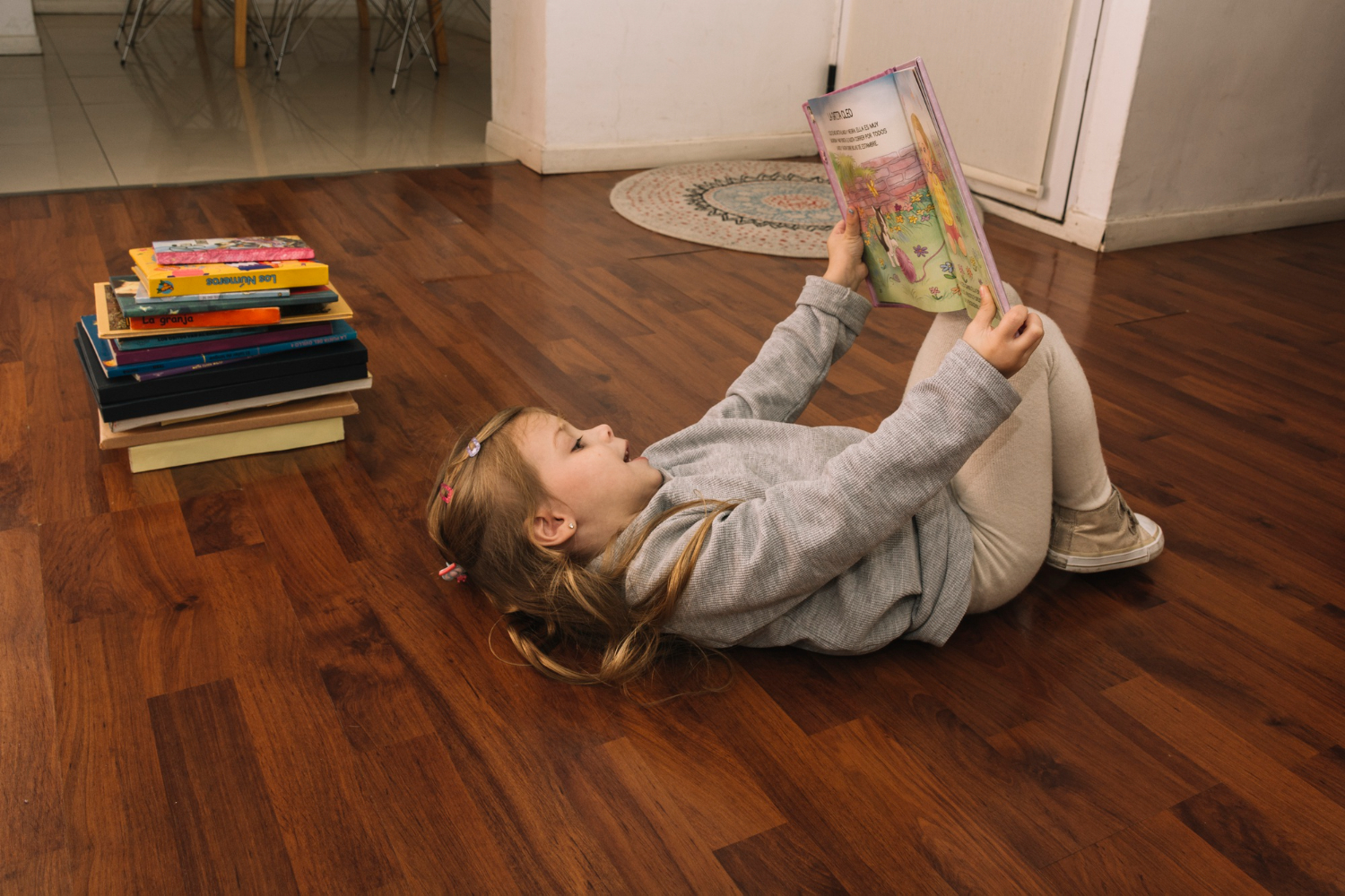
Selecting the right luxury vinyl plank (LVP) flooring color can completely transform the atmosphere of a home. Beyond durability, style, and texture, the color tone of flooring—whether warm or cool—sets the emotional and visual tone of the entire space. Warm tones bring coziness and comfort, while cool tones evoke calm and sophistication. Understanding how these tones influence mood, lighting, and design cohesion can help homeowners make confident choices when upgrading their floors.
Which LVP color tone fits your home’s personality best?
Color tones fall on a spectrum. Warm tones—think golden oak, honey maple, or chestnut brown—carry hints of red, orange, or yellow. These colors add richness and make rooms feel welcoming and intimate. Cool tones, on the other hand, like ash gray, weathered oak, and driftwood beige, have undertones of blue or gray. They create a more modern, spacious, and relaxed feel.
Luxury vinyl plank flooring captures both ends of this spectrum beautifully, offering homeowners endless possibilities. Whether the goal is to create a rustic retreat or a minimalist modern interior, LVP’s vast range of wood-look designs ensures the perfect fit for every style.
How lighting affects LVP color perception
Natural and artificial light can dramatically shift how flooring tones appear. In rooms with abundant sunlight, warm tones often glow brighter, enhancing their cozy appeal. In contrast, cool tones tend to appear softer and more muted, amplifying a serene atmosphere.
For darker rooms with minimal natural light, warm tones can counteract shadows and add brightness. Meanwhile, cool tones can help balance overly bright rooms by introducing a calm neutrality. Always test flooring samples under different lighting conditions before making a final decision—it’s one of the easiest ways to avoid surprises after installation.
When to choose warm tones for your home
Warm-toned LVP flooring works beautifully in spaces meant to feel inviting and lived-in. It’s a natural choice for open-concept living rooms, cozy bedrooms, and family areas. These tones pair well with traditional or farmhouse-inspired interiors, where organic textures and layered color palettes shine.
Warm tones also complement furniture and décor featuring natural materials such as wood, leather, and woven fibers. Pairing honey oak or rich walnut LVP with cream or beige walls can create a timeless look that feels both elegant and grounded.
When cool tones make the perfect match
Cool-toned LVP flooring is ideal for homeowners aiming for a sleek, contemporary look. Shades like gray oak, whitewashed pine, or coastal driftwood enhance the feeling of space and light. They blend seamlessly with minimalist design, coastal aesthetics, or industrial-inspired interiors that feature metals, glass, and crisp color contrasts.
Cool tones are also perfect for humid climates or sun-drenched regions, where their airy, refreshing undertones help balance natural warmth. Pairing these planks with cooler wall colors like white, navy, or charcoal produces a polished, balanced look that feels effortlessly modern.
Finding balance: mixing warm and cool elements
A sophisticated home design doesn’t have to commit fully to one color temperature. Mixing warm and cool elements can create visual interest and depth. For instance, pairing warm-toned flooring with cool-gray walls can introduce contrast while keeping the space cohesive. Similarly, cool-toned LVP can serve as a neutral backdrop for warm accents like gold hardware, wooden furniture, or terracotta décor.
The key is balance—using one tone as dominant and the other as an accent ensures harmony instead of competition. This blending approach is especially effective in open floor plans, where transitioning between tones helps define different functional areas without disrupting flow.
Coordinating flooring tones with other surfaces
When selecting an LVP color palette, consider the bigger picture—cabinets, countertops, and paint colors should all work together. For kitchens and bathrooms, matching undertones is crucial. A warm caramel LVP pairs best with granite or quartz that has brown, gold, or beige veining. Meanwhile, gray or greige LVP floors complement cool-toned countertops like marble or concrete-look quartz.
If mixing materials such as wood cabinets and LVP flooring, contrast is often more effective than matching. A lighter warm floor beneath dark cabinets can open the space visually, while a deeper cool tone under light cabinetry creates grounded sophistication.
How lifestyle influences your LVP tone choice
Beyond aesthetics, lifestyle can guide tone selection. Families with pets or children may prefer mid-tone warm or cool floors that disguise dust and scuffs better than extreme light or dark shades. Homeowners who frequently entertain might lean toward warm floors that foster energy and conversation, while those seeking a calm retreat may find cool tones more relaxing.
Ultimately, flooring should reflect how the space is lived in—not just how it looks.
Don’t just imagine stunning floors—see them in person with our in-stock LVP collections
Selecting between warm and cool LVP tones is more than a design decision—it’s about shaping the atmosphere of every room. The flooring experts at The Design Gallery by Paul Evans are ready to help find the perfect balance for any home style or lifestyle. With West Texas’s largest in-stock flooring selection and immediate professional installation, transforming your home has never been easier. Visit our flooring stores to explore the best options for homes across Odessa, Midland, Andrews, Fort Stockton, and Big Springs, TX.


